ROON
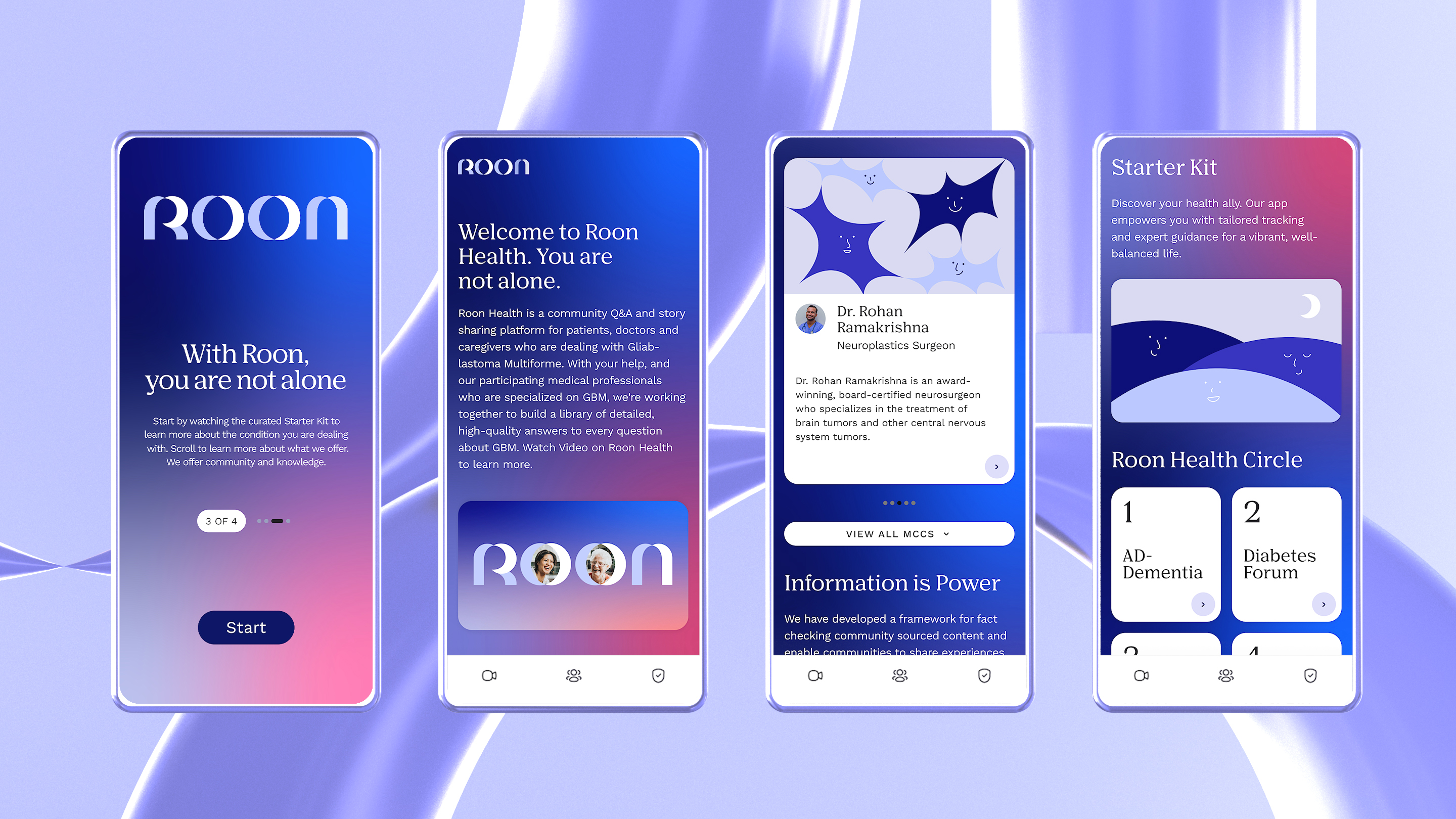
Roon is a health Tech company for people navigating complex health conditions. The word "Roon" is derived from the Arabic word "Noor", that refers to the "Divine light of the night". This insight perfectly reflected the character of the company and directly informed the moon-like letterforms coming together to compose a delicate & humanizing logotype that honors Roon's mission to help people shed a light on complex health conditions. View full case study.
In this project, I was in charge of motion design, 3D design and case study.
Branding / Motion Design / 3D Art
In this project, I was in charge of motion design, 3D design and case study.
Branding / Motion Design / 3D Art


Agnecy
Sunday Afternoon ︎︎︎Creative Director
Ahmed KlinkJuan Carlos Pagan
Art Director
Beatriz LozanoDesigner
Ruiqi ZhouZane Zhang
Xiaoyu Xue
Karan Kumar
Simon Freour
Aarman Roy